Asset Layer Landing Page Redesign
Attracting Users and Reducing Churn
Client: Asset Layer
Time Allotted: 2 Weeks
Tools: Figma, Zoom for User Testing
Asset Layer Website: AssetLayer.com
Introduction:
In life, you only get one chance to make a first impression. This impression is particularly important in the world of digital SaaS companies, where a good landing page can be the difference between a potential customer signing-up for the service or closing the page before even reading a description. As such, when our team saw a particularly high churn rate for new users visiting AssetLayer.com, it became a priority to improve that first impression.
This case study will walk through the full process of redesigning the Asset Layer Landing page. Before beginning, it is important to understand the context around Asset Layer as a company.
Asset Layer is a next-gen UGC platform that transforms games into thriving creator ecosystems, providing new content for players, increasing retention, boosting monetization, and driving user-acquisition. This is done through a number of features that let developers fast-track their own applications, turning them into full ecosystems with exchangeable assets and enabling 3rd-party creators to submit their own content to applications.
Asset Layer is a “startup” and as a result has limited time and resources. As such, a priority of the design process is to move quickly and keep designs as lightweight as possible to prevent needless bloat for developers. Scope creep is a serious concern and is monitored throughout the process.
As the lead designer for Asset Layer, the vast majority of Mockups, Prototypes and Design components used to complete this project were built by myself in Figma
The problem:
The previous version of the Asset Layer landing page was suffering from a churn rate for new users that was too high. Too many users were leaving the website before creating an account or clicking additional links to learn more. Additionally, as Asset Layer has evolved and adapted , the targeted user group and product offerings have changed. The previous landing page does not accurately reflect those changes.
The Goal:
Created a new lightweight landing page that reduces the churn rate for new users and more accurately reflects the offerings of the Asset Layer product. Ultimately, the new page should lead to a higher success rate of user sign-ups and interactions with Asset Layer.
Constraints:
Due to the startup status of Asset Layer, it is essential that this project remains limited in scope and time to create. Ultimately, I had roughly 2 weeks to work through the design process (including testing). It was equally important that the structure and design of the page remained relatively simple, so that Asset Layer’s engineering team would be able to make the changes quickly and efficiently. Simplicity is king.
Competitive Research:
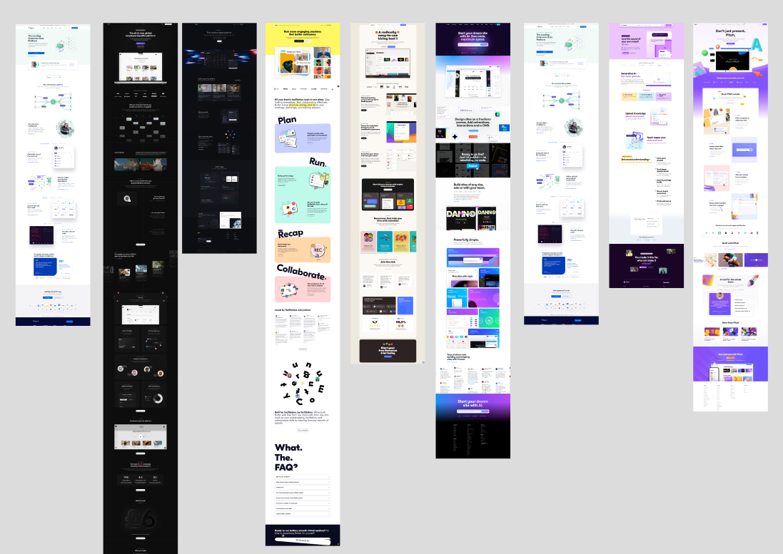
Given the limited resources of Asset Layer, it’s important not to waste time building things that ultimately are not helpful to our end goals. In order to ensure that the designs we produce are effective, we conducted research on competitors in the space. This research helps to produce insights such as:
Insight into what competitors may be doing right OR wrong
Insight into what our users may already be expecting from a SaaS Product in the same space as Asset Layer
I’ve included some screenshots below of the landing pages I checked out from other competitors in the space. This research had a huge impact on not only the content of the page, but also the tone and general aesthetic theme.


Previous Iterations:
Given that this particular project was a quick redesign of an already existing landing page, it was not in our best interest to just throw out the old and start from scratch. Instead, it made much more sense to grab the parts of the existing page that we felt were working and remove any sections we felt were not performing well. I’ve included a screenshot of the previous version, for brevity’s sake I won’t list all of the issues we identified but have included a few of the more major insights.
One of the major flaws we identified from feedback (and as a result of user testing) was the overreliance on copywriting to convey the product message. This caused users to feel overwhelmed by the amount of information available to them and confused about which information to prioritize reading.
In particular we found that the middle portion titled “Asset Layer is a Game Changer” was more confusing to users than we anticipated. During our user testing sessions, we asked users to read that portion and describe their understanding of the information. Many of these users had trouble following the images and explanations, and as such, we decided that an added emphasis on simplicity was needed.
The Design Process
User Testing, Feedback, and Iterative Design:
In combination with the competitive research that we completed, we also spent a significant amount of time working directly with users from our community to garner feedback regarding readability and aesthetics of the page. When completing new drafts of the design, I would show them to customers and our team to get input on potential flaws and issues. This resulted in a cyclical design process of tweaking and testing which resulted in a large amount of discovery of assumptions in the design process. It was these user testing sessions that lead us to reconsider design aesthetics and the quantity of copywriting on the page.
Establishing a Design Theme:
A particularly important insight that came about during the competitive research phase of the project was that the overall aesthetics of the previous landing page lacked real character. It was simply too sterile and uninviting. This led our team to emphasizing a more sleek and “futuristic” approach. We ultimately decided to shift the color pallete as well, moving away from black/white colors and more towards colorful gradients combined with blues and yellows that make elements really pop from the page. You’ll also notice a significant increase in the number of images and a more creative and playful layout. Please keep in mind that all of this was done while still remaining under the umbrella of our branding guidelines.
After showing these new design themes to our users, we noticed a significant uptick in the overall excitement users had about the product. The team strongly believes this change was integral to the improved metrics we saw after implementing the new designs.
Copywriting and Description Simplification:
As mentioned earlier, one of the major pieces of feedback we received during the user testing process was that there was simply too much copy text on the page. Moving forward, we made it a focus to limit as much of the copy as possible and try to “show” rather than “tell” wherever we could. This was not an easy process, as describing complex systems with simple and short language can be quite tricky. Ultimately, we felt that if something could not be explained in two sentences, then it needed to be paired with an illustration or additional visual content.
This helped to improve not only the overall readability of the page, but also added to the overall aesthetics by creating a more equal balance between image and text.
Design Breakdown
Introductory Block:
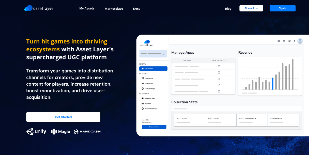
If a landing page is a first impression, the introductory block is the very first thing you say. For Asset Layer, we wanted all text to be short and to the point. The introductory block contains a quick description of the product, while emphasizing the main call to action to Get Started. We also included a simplified image of the product, which helped demonstrate the functionality and sleekness of the platform.
We combined these components with a few of our partner logos to establish credibility and entice users to enter into the new-user funnel.
At the core, the intro block is the most important part of the entire page, and with this design we found a significant update in the number of visitors clicking our call to action.
Descriptive Block:
The second block on the landing page is referred to by our team as the “Descriptive Block”. This is common across competitors in the SaaS space and serves as an “Elevator Pitch” of the product and its offerings. Compared to our previous version of the block, this version has a higher emphasis on leveraging images to provide additional context to each feature.
When visiting the actual live version of the site, this block contains some neat animations that playout during scrolling. These were included to improve the sleek aesthetic of the page.
Features Block:
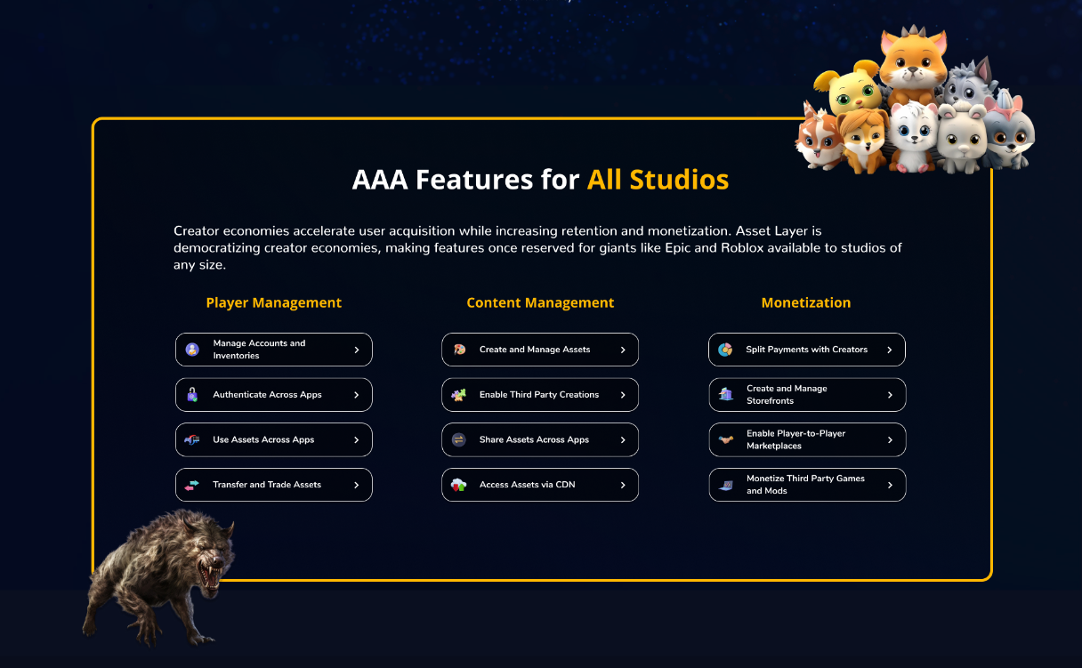
The features block is the most descriptive portion of the landing page. It contains a list of features offered by the Asset Layer platform across a variety of different use cases. Each individual feature links to the corresponding part of our documentation that provides a more in-depth description of the technical aspects of that feature.
The intention here is to provide potential customers with a full understand of the Asset Layer product at a glance, while also allowing those who needed additional context to easily access that information. Each feature is paired with a corresponding icon, to provide a little bit of additional pop and ensure that the component does not feel too heavy on the copy writing side.
You also notice the use of game assets to help provide more playful aesthetic to the page as a whole, a strategy our team emphasize after seeing it during competitive research.
Demo Block:
The demo block was one of the components that carried over from our original landing page design. During discussions with customers, we found that many of them were interested in seeing a demo of the product at work. This video served to provide a lightweight demo of the offerings of Asset Layer, as well as showcasing how easy it was to use and integrate the product with a customer’s application.
Example Applications:
A discovery made through our competitive research was the importance of demonstrating applications that were built on the Asset Layer platform. In Asset Layer’s case, we decided to focus on two applications built by the internal team at Asset Layer (and designed by myself), these projects were built to help demonstrate the power of the Asset Layer platform and to provide further insights into what features users might want for their own apps.
We ultimately decided on the classic carousel design for this section, as the applications were best demonstrated by multiple images and a limited amount of caption copy writing.
For those who are interested, you can check out one of these applications at Rolltopia.games to get a better sense of Asset Layer at work as well as see some of the additional (and fun!) design work I’ve completed at Asset Layer.
Contact Form:
The contact form was an idea that came out of a combination of competitive research and our team’s experience fundraising. We noticed that not only did multiple competitors have a calendar feature like this, but also that a number of our customers wanted to discuss different features via zoom calls.
Ultimately this allowed potential customers to quickly setup a meeting with someone on our team to discuss the solutions that Asset Layer offers. Almost every user who scheduled a call with our team ended up creating an Asset Layer App.
Footer:
Although often overlooked in world of web design, the footer can serve as an integral directory of the different offerings a company provides. In our case, it allowed us to link to some additional services and products outside of our top nav. This included resources like our blog and social accounts, as well as links to our other apps built using the Asset Layer platform.
Mobile Support:
Although the Asset Layer application itself is almost entirely used by desktop users, our analytics tells us that many visit Asset Layer for the first time via a mobile device. This traffic is usually a result of engagement on our social platforms or blogs.
As such, it was a priority for our team that our design function well on resolutions across a variety of devices. During the design process, I leveraged breakpoints along with multiple Figma mockup variations to ensure a pleasurable experience for all device types. This is best demonstrated by visiting the website itself on a mobile device, but I’ve also included a quick image of mobile variation as well to demonstrate the designs flexibility.
Final Design and Next Steps
Final Design:
Included in this case study is an image of the full landing page after completing our redesign. However, I highly recommend checking out the live site at AssetLayer.com
The live site includes additional animations that help to enhance the overall aesthetics of the page, as well as the ability to adjust window sizing to experience the different layouts of the site at various breakpoints.
Measuring Success and Next Steps:
After implementing the design changes and pushing them to the live site, we were happy to see a significant increase in the number of users who created an Asset Layer account and Asset Layer app upon their first visit to the site. Additionally, we saw a growth in the average amount of time a user spent on the page, as well as an increase in the number of users who clicked a secondary link on the page (i.e. documentation, blogs, etc..). This downward trend in the overall churn rate aligned with our overall goal in the redesign.
That said being said, no design is perfect, and any good design can be bettered through increased user testing and additional design iterations. Although this is not currently a main priority for the Asset Layer team at the moment, we do plan on continuing to revisit the design and make improvements based on our user feedback and analytics. There are portions of the website that we don’t believe are performing as well as they could be, and as such we have additional plans to alter copy text and images where appropriate.


